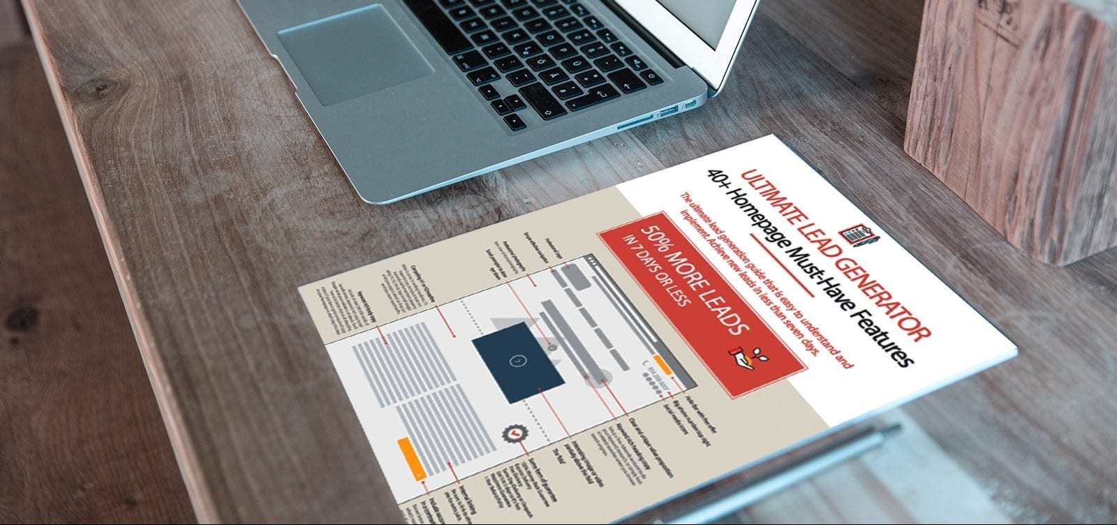
When designing websites, companies have key factors they should meet before a website is launched. Unfortunately, many website owners do not meet these criteria. There are many sites out today that are in dire need of modification, which could really help in finding better clients or customers. These common mistakes can be easily fixed.
1. Does the business or website have a Logo?
A logo is the business’s identity, “your brand”. This helps people understand who you as a business are. A logo makes people recognize you. It should be on every web page ideally on the top left-hand side as that’s where your visitors will expect to see it.
2. Is the menu navigation easy to use?
If the navigation of your website isn’t as clear visitors will have a hard finding their way around, which frustrates people. You want visitors to always know where they are, where they can go, and how to get back again.
3. Are there social media share buttons?
Consumers believe 15% of what a brand says about itself, but 76% of what their peers say about a brand; a good website can help you take advantage of this by making your content shareable across different types of social media.
4. Is there a call to action or key message in the main banner?
If you are missing a call to action or key message, you’re missing a key component that you will keep you visitors captive. This works best as a strong key message with high-quality visual images. I can’t tell you how effective this is for converting visitors into customers.
5. Is there a contact number on the top of the website?
The websites that give you the best return make it easy for web visitors to contact you. You should have a phone number on the top of your website. People don’t have the patience to click through to contact us page anymore (especially if they’re on a mobile and the menu buttons are too small to click), you could be losing a lot of potential customers right now.


